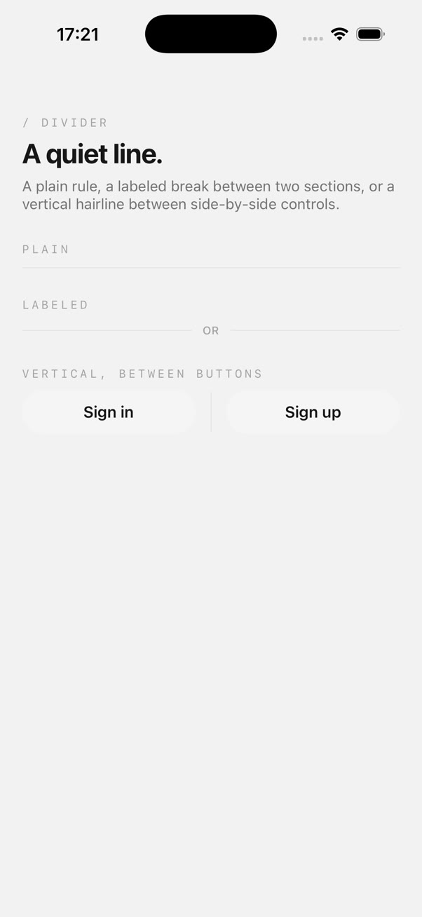
The label splits the line into two flex children, not one line with text on top.flex-1 on each segment centers the label exactly regardless of how long it is, with no manual width math.
orientation="vertical" ignores label on purpose, with a dev-only warning if you pass both. A vertical hairline between two side-by-side elements has no natural place for centered text, so rather than silently misrender it, this flags the mistake and renders the plain line.
color bypasses the theme entirely. When set, it's applied as an inline background color and the default light/dark neutral classes are dropped, mixing both would mean the class only sometimes wins, depending on style resolution order.
The fade-in is opacity only, no translate. A divider has no natural direction to arrive from, so it just settles into visibility over 200ms instead of sliding in like a card or a toast would.